It's a Friday night in Delray. A couple is standing on Atlantic Avenue, phones out, deciding between your place and the spot two doors down. They tap your Google listing, land on your website, and wait. The homepage is loading a full-screen video of a sizzling pan. Three seconds pass. The menu is a PDF that opens sideways and forces them to pinch-zoom. The "Reservations" button links to a page that 404s because the booking widget changed last spring. By the time your beautiful site finally settles, they've already booked the neighbor and are walking through their door.
I'm Daryl, and I design websites for a living — a lot of them for South Florida restaurants. That scenario isn't hypothetical; I've watched it happen in analytics sessions, and it's the single most expensive thing a restaurant site can do. So let me tell you what a restaurant website actually needs to do to drive reservations and orders in 2026, what's a genuine waste of money, and roughly what all of it costs down here.
What a restaurant website is actually for
Here's the mindset shift I try to give every restaurant owner I work with: your website is not a brochure, it's a conversion tool. Ninety percent of the people hitting it already know your name — they Googled you, saw an Instagram tag, or drove past. They're not browsing for inspiration. They have one of four intents:
- See the menu (by far the most common — usually 50-70% of mobile traffic goes straight to it)
- Book a table or join a waitlist
- Order pickup or delivery
- Find you — hours, address, parking, "are you open right now"
That's it. Everything else on the page is supporting cast. When I design a restaurant site, I'm ruthless about getting those four jobs done in as few taps as possible, because every extra second and every extra tap bleeds reservations. The average restaurant website visit lasts under a minute — you are not going to win anyone over with clever copy. You win by being instantly, obviously useful.
The South Florida market is not one market
Designing for a restaurant in Palm Beach County is genuinely different from designing for one in, say, Nashville, and it's because of who's actually sitting in the seats. You're serving at least three distinct crowds, and they behave differently.
Seasonal swing is brutal and you have to design for both ends
From roughly November through April, the snowbirds and tourists arrive and traffic can double or triple. In August, half your regular clientele is up north and it's dead quiet. Practically, that means your site has to make it trivially easy to update: seasonal menus, holiday hours, "we're closed for August" banners, brunch that only runs in-season. If a restaurant has to email me every time they want to change a price or a closing time, the design has failed. I build these on a CMS the staff can actually operate — usually a headless setup or a well-structured page builder — so the manager updates it from their phone in ninety seconds.
Tourists behave differently than locals
A tourist in from Ohio is searching "best seafood near me Boca Raton" on their phone, cares intensely about photos and reviews, and is deciding in real time on the sidewalk. A local already loves you and just wants to book their usual Saturday table without friction. Your site has to serve the impulsive first-timer and the loyal regular. The first needs gorgeous photography and a frictionless first impression; the second needs a two-tap reservation and maybe a loyalty or private-events link. Ignore either and you leave money on the table.
Upscale and casual want opposite things
An upscale spot on Worth Avenue or in Palm Beach needs restraint — generous whitespace, editorial photography, a reservation flow that feels like a concierge, not a fast-food kiosk. A casual burger joint in Lake Worth needs the online-order button front and center, big and loud, above the fold. Same discipline, completely different volume. When someone shows me a "premium" template with animated confetti and I can tell they run a $200-a-head tasting menu, we have a conversation.
The features that actually drive reservations
A real, fast, HTML menu — never a PDF
I'll die on this hill. PDF menus are the number one mistake I see, and they're everywhere down here. A PDF forces a mobile user to download a file, pinch-zoom, and scroll sideways. It's invisible to Google (so your dishes never show up in search), it's inaccessible to anyone using a screen reader, and it's a pain to update. A proper menu is real HTML text — it loads instantly, resizes to the phone, is fully searchable and indexable, and lets me add little conversion touches like dietary tags, "chef's pick," or a photo on the three dishes you most want people to order. If you take one thing from this article: kill the PDF menu.
Online reservations and waitlist, integrated cleanly
Most South Florida restaurants I work with are on OpenTable, Resy, SevenRooms, or Tock. Great — but how you embed them matters enormously. The right way is an inline widget or a booking button that opens the flow in one tap without dumping the guest onto a stranger's website that looks nothing like yours. The wrong way — and I see it constantly — is a "Book Now" link that points to an old, dead URL because you switched platforms and nobody updated the site. Broken reservation links are silent revenue killers. Test yours right now on your phone. I'm serious. I find a broken or misrouted booking link on roughly one in three sites I audit.
Mobile-first, because your traffic already is
For restaurants, 70-85% of traffic is mobile, and on Friday and Saturday nights it's higher. So I design the phone layout first and the desktop version second — the opposite of how a lot of agencies still work. Big tap targets, a sticky header with "Menu / Reserve / Call / Directions" always within thumb reach, and no hover-dependent menus that don't exist on a touchscreen. If the phone experience isn't excellent, nothing else you spent money on matters.
Google and maps integration
Your website and your Google Business Profile have to agree. Hours, address, and phone number need to match exactly — Google punishes inconsistency, and a tourist who sees "open till 11" on Google and "closes at 9" on your site just distrusts both. I make sure the site has proper local business structured data (schema markup) so Google can pull your hours, menu, and rating into search results, click-to-call works on the first tap, and "Directions" opens Apple or Google Maps natively. This is unglamorous plumbing that quietly drives a huge share of real-world visits.
Photography that sells the room and the plate
This is where design and revenue meet most directly. People eat with their eyes, and in a market this competitive, mediocre photos read as a mediocre restaurant. But — and this is the trap — heavy, unoptimized images are the number two reason restaurant sites are slow. A gorgeous 8-megabyte hero photo straight off the photographer's camera will tank your load time. My job is to make the images look stunning and load in under a second: modern formats (WebP or AVIF), proper sizing, lazy-loading below the fold. You get the beauty without the penalty. Budget for a real photographer — expect $800-$2,500 for a proper shoot down here — because stock photos of food that isn't yours fool no one.
Online ordering, if it fits your model
For casual and fast-casual spots, direct online ordering (or a clean link to your ordering platform) belongs above the fold. The nuance: third-party apps like DoorDash take 15-30% per order, so if you can drive even a slice of orders through your own site or a lower-fee platform, that goes straight to your margin. I'll design the site to nudge guests toward direct ordering without hiding the options they expect.
What's actually a waste of money
I'd rather talk a client out of spending than pad an invoice, so here's what I routinely tell restaurants to skip:
- Full-screen autoplay video on the homepage. It's the single biggest load-time and data-cost offender, and it delays the four things people actually came for. A short, muted, optional clip lower on the page is fine. A mandatory 12-second intro is not.
- A custom-built reservation system. Resy and OpenTable already solved this for a monthly fee. Paying a developer $15k to reinvent it is money set on fire.
- A blog nobody maintains. Unless you genuinely have someone to write it, an abandoned blog with one post from 2023 just signals neglect.
- An app. Ninety-five percent of restaurants do not need a native app. A great mobile website does the same job at a fraction of the cost and nobody has to download anything.
- Fancy scroll animations and parallax everything. A little motion adds polish; a lot of it adds load time and makes the menu harder to reach. Restraint reads as premium.
What it actually costs in 2026
Real numbers, South Florida market, so you can sanity-check any quote you get:
- Template / DIY (Squarespace, Wix): $300-$2,000 to set up plus $20-$50/month. Fine for a brand-new spot on a shoestring, but you'll fight the platform on menu structure and speed.
- Professional custom site, single location: $4,000-$12,000 one-time. This is the sweet spot for most independent restaurants — a fast, mobile-first, CMS-driven site with reservations, real menus, and Google integration done right.
- High-end / multi-location / hospitality group: $12,000-$30,000+, usually because of multiple locations, reservation systems, gift cards, events, and a distinct brand system.
- Ongoing: plan on $50-$300/month for hosting, maintenance, and platform fees, plus $75-$150/hr if you want a pro handling seasonal updates.
Timeline for a solid custom restaurant site is typically 3-6 weeks — faster if your menu and photos are ready, slower if we're waiting on a photo shoot or you're still finalizing the concept. Anyone promising a genuinely custom, well-photographed restaurant site in 3 days is either using a rigid template or cutting the corners that actually matter. If you want to see how we scope and price this kind of work, our pricing page lays it out plainly, and there's more on process on our web design page.
Frequently asked questions
Do I even need a website if I'm on Instagram and Google?
Yes. Instagram is where people discover you; your website is where they convert. You don't control your Instagram feed's algorithm or your Google listing's layout, but you fully control your site — and it's the one place you can put a menu, a reservation button, and your hours exactly where you want them. Think of social as the front door and your site as the host who actually seats people.
Can I just use my reservation platform's built-in page?
You can, and it's better than nothing, but those pages are generic and don't rank in search, don't tell your brand's story, and don't let you control the menu or photography. Use the platform for what it's great at — the booking engine — and embed it into a site that's actually yours.
How fast does my site really need to load?
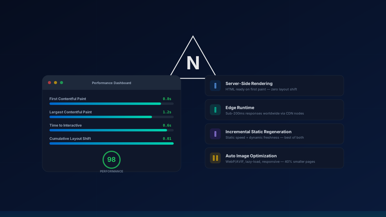
Aim for a largest-contentful-paint under 2.5 seconds on a phone over cellular data, which is the standard Google actually measures. In practice that means optimized images, no autoplay video hero, and a real HTML menu. On a hungry Friday-night crowd, the difference between a 1-second and a 5-second load is measurable in walk-ins lost to the place next door.
Should I handle my own SEO or hire someone?
For a single restaurant, the fundamentals get you most of the way: an accurate Google Business Profile, a fast indexable site, real menu text, local structured data, and consistent hours everywhere. That's mostly baked into good design. If you're competing in a saturated area or running multiple locations, targeted local SEO is worth it — but be wary of anyone selling you a pricey national campaign when what you need is to win "near me" searches within five miles.
What's the one change that would help my current site most?
Replace the PDF menu with real, fast-loading HTML text, and test that your reservation button works on a phone. Those two fixes alone recover more lost reservations than any redesign gimmick, and I'd start there before spending a dime on anything flashier.
The bottom line
A restaurant website in South Florida doesn't need to be clever — it needs to be fast, mobile-first, and ruthlessly focused on the four things a hungry person actually wants: the menu, a table, an order, and directions. Nail those, kill the PDF, respect the seasonal swings and the mix of tourists and regulars, and your site quietly becomes one of your best hosts. Spend the rest on great photography and skip the autoplay video.
If you want a second set of eyes, I'm happy to take a look — reach out here and I'll tell you honestly what's helping and what's hurting. You can also browse some of our recent work, and if you're weighing who to hire, my partner Mario and I wrote an honest guide to the best web designers in Palm Beach that's worth a read before you sign anything.